RE FRAMED IT
Branding
Graphic Design
Visual Identity
Logo Design
Social Media Graphics
Content Direction
Graphic Design
Visual Identity
Logo Design
Social Media Graphics
Content Direction
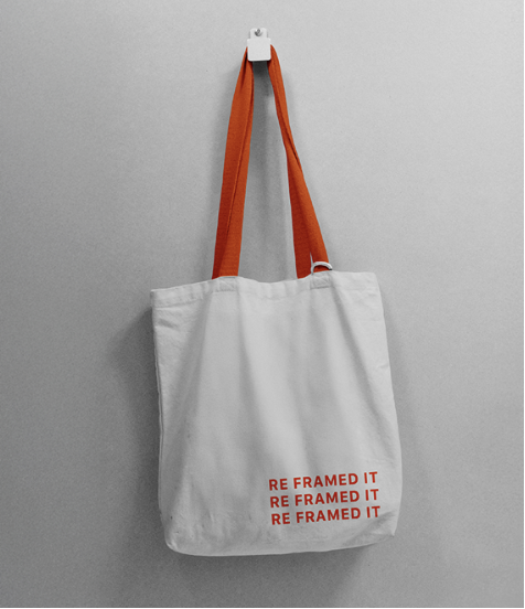
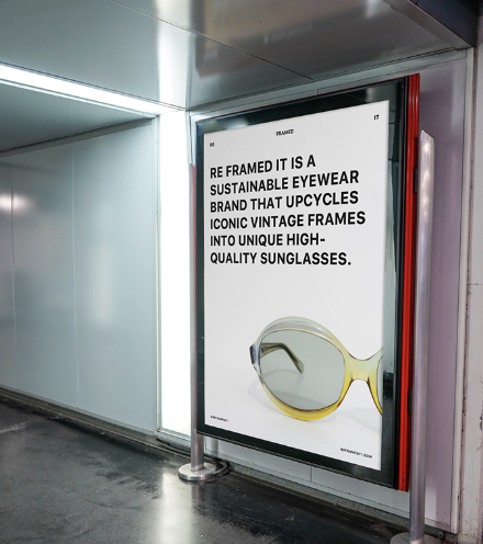
RE FRAMED IT is a purpose-driven brand giving vintage eyewear a second life as sunglasses. I developed a visual identity and storytelling system that reflects the brand’s sustainability mission and fashion-forward aesthetic, using a modular typographic logo, inclusive product photography, and vibrant lifestyle imagery. The identity celebrates the history and character of each frame while educating and engaging users about upcycling and circular design, turning RE FRAMED IT into a stylish, meaningful, and socially conscious brand.


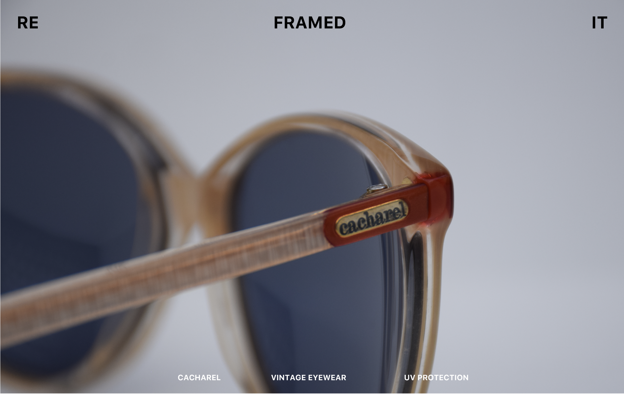
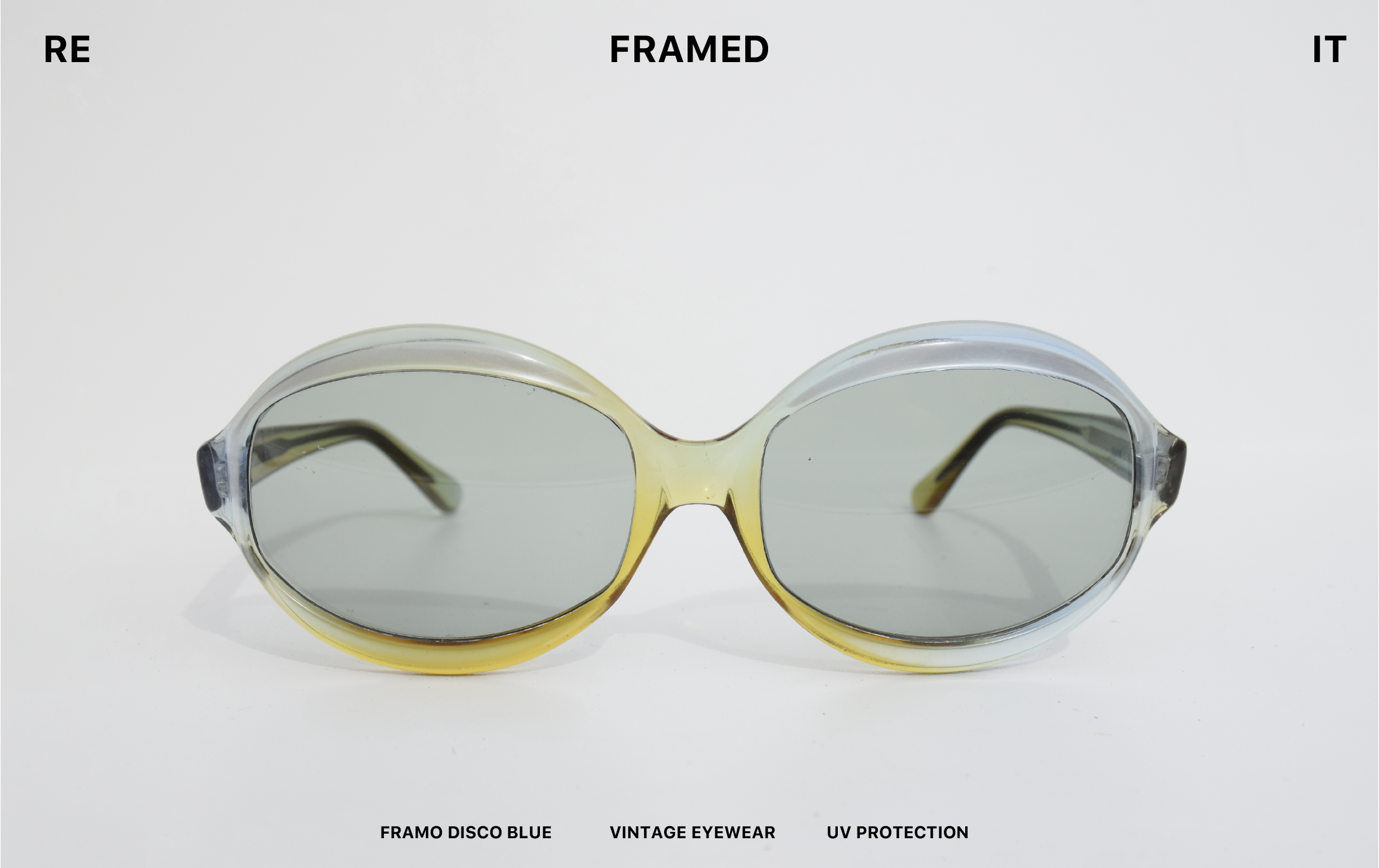
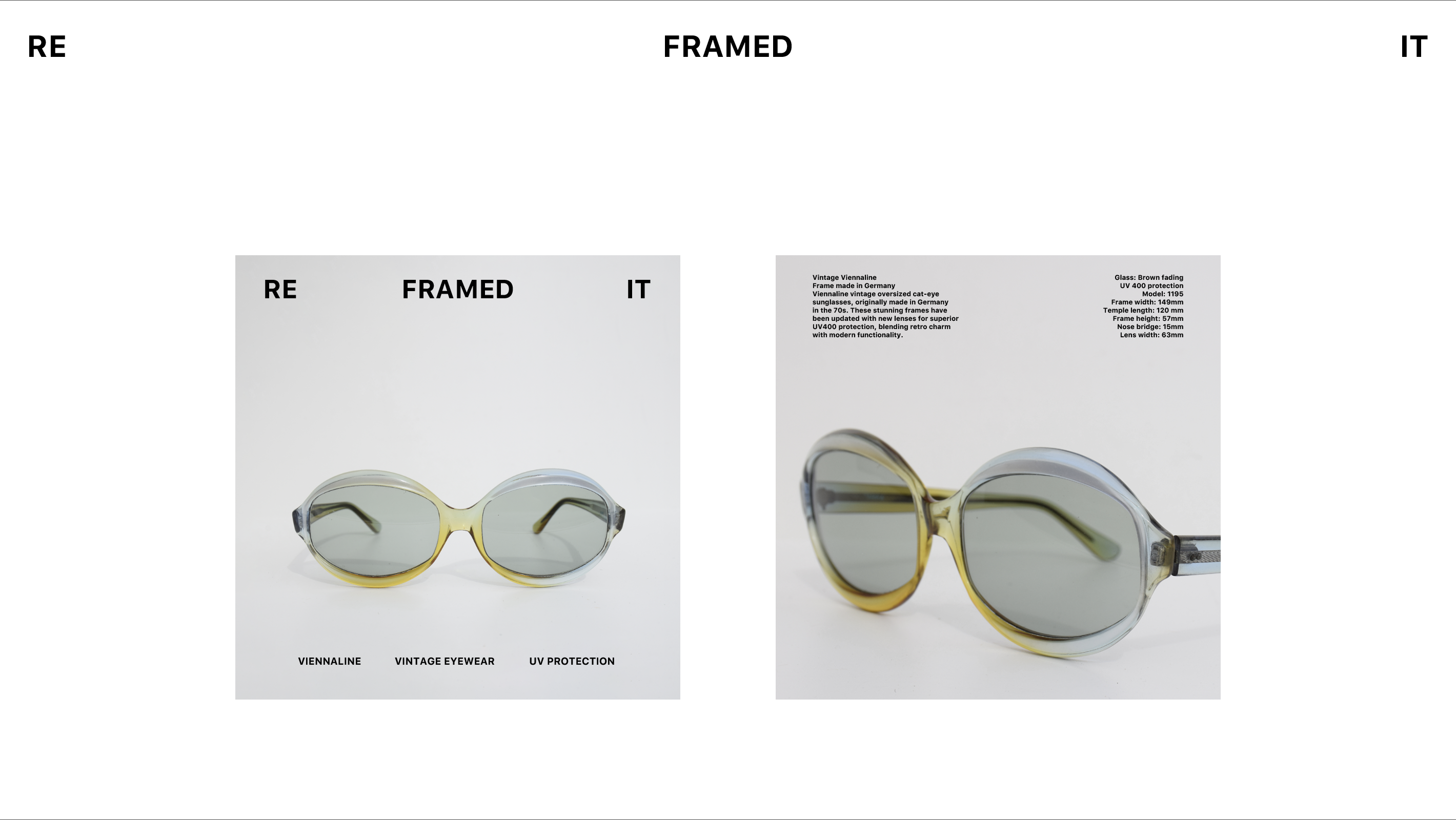
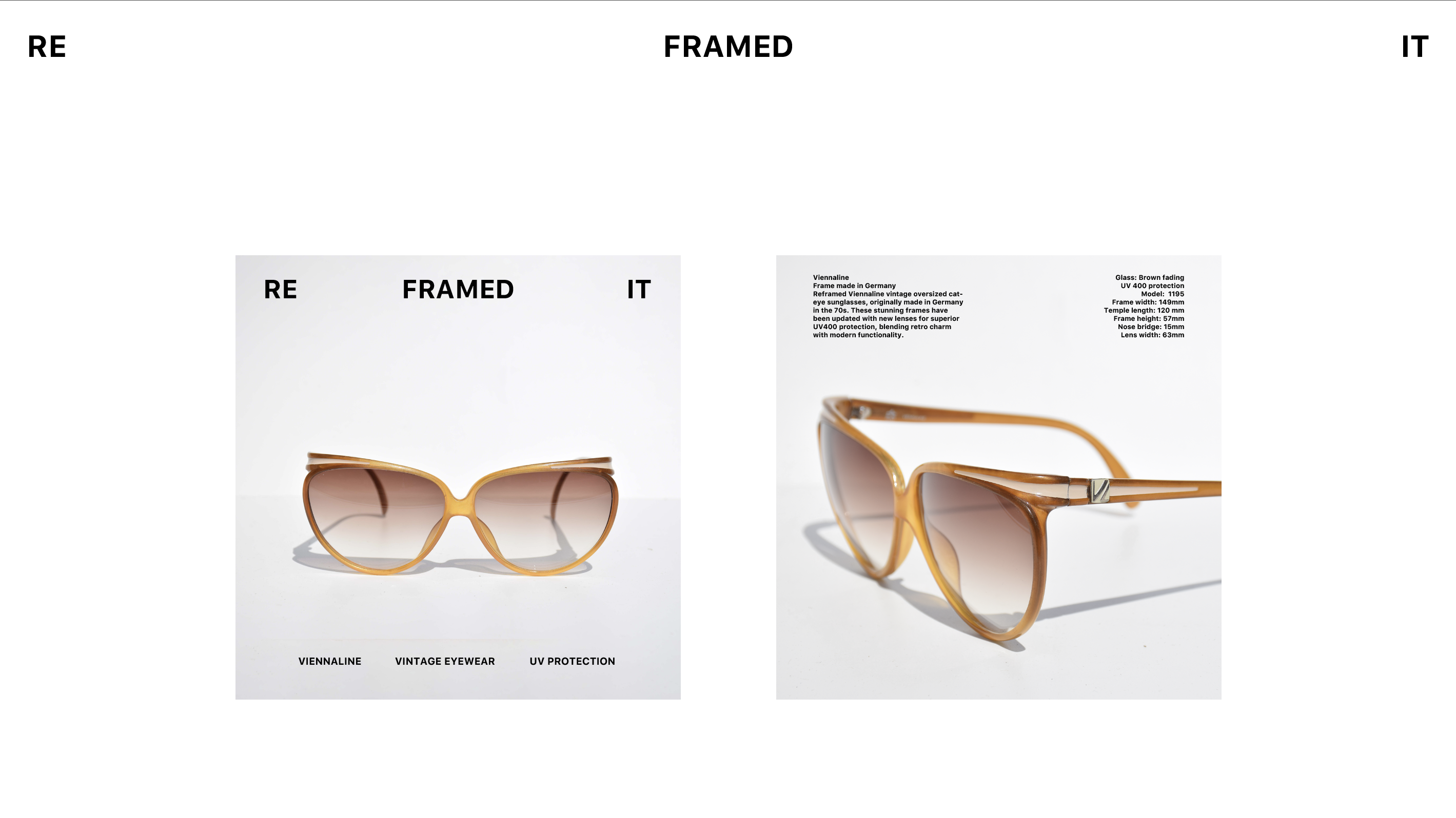
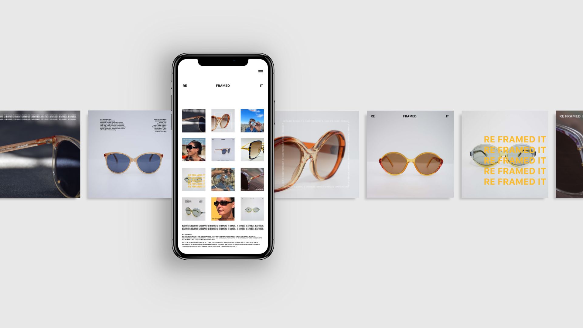
Working closely with the founder, I developed a visual storytelling approach to branding that highlights the transformation of objects—and perspectives. The name RE FRAMED IT became central to the design language. It not only suggests the physical reframing of eyewear but also symbolises a shift in how we view waste, value, and function.